Custom Themes for Rise 360
Latest Theme Components for Rise 360
-
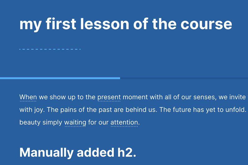
Rise 360 styling the lesson progress bar (Rise Theme only)
This CSS restyles the lesson progress bar, increasing it’s height (so users can see it) and also add a secondary color, as it can be difficult to see against your theme color.
-
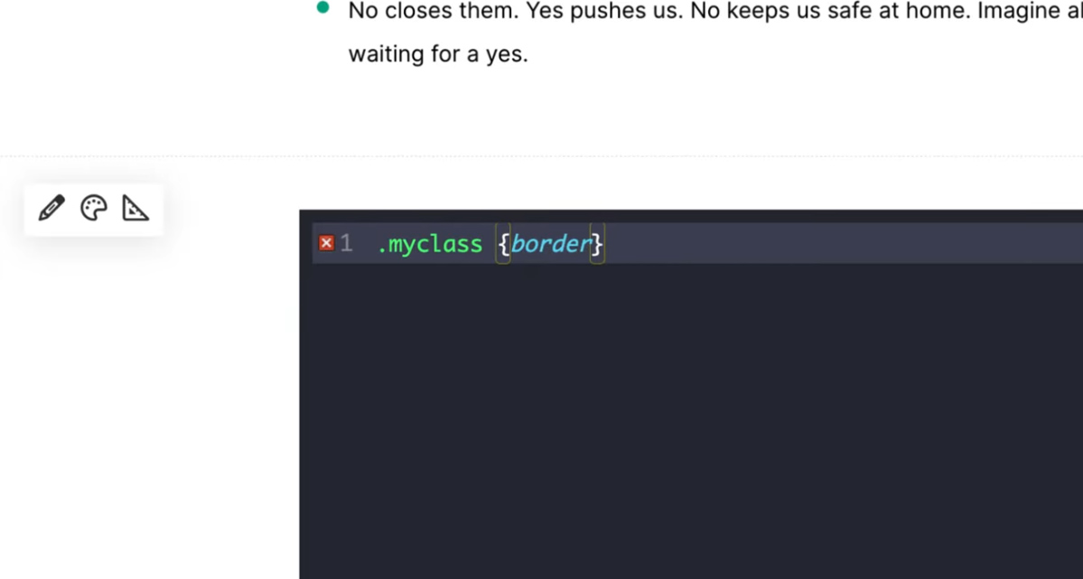
Add a code validator to your Rise 360 course
HTML used in example (add to a Custom Code block)
-
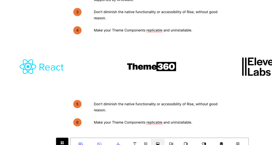
Slick.js in Rise 360
A simple responsive carousel for rotating logos. For use this in the new ‘custom code’ block.
-

Hide the Rise 360 Quiz Results screen
-

Rise 360 breakpoints (media queries) CSS
-

Rise 360 Tabs UI
A dark mode for your tabs.
-

Matching quiz customization
This theme component hides the numbering and adds the interlocking “puzzle piece” UI to the matching cards. Download the zip containing css and image file.
-

How to Load Adobe Fonts in Rise 360
Code used in the video:
-

Highlight.js integration for Rise 360
Style your code samples with a custom highlighted color palette. Download Working Sample: Code to be added to your index.html file after copying the /theme folder to your exported course. Make sure the /theme folder is placed alongside (in the same folder) as the index.html file.
-
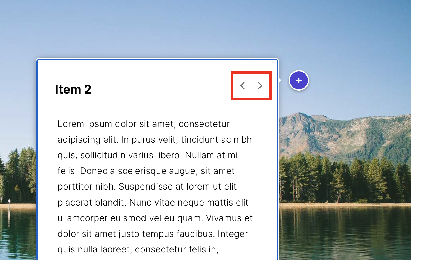
Remove prev/next arrows in labeled graphic popovers
This CSS theme component visually hides the arrows (outlined in red). The arrows can cause confusion to the learner, as the interaction will eventually loop back to the beginning of the markers. First time installing a CSS Theme Component? Watch this video:
-
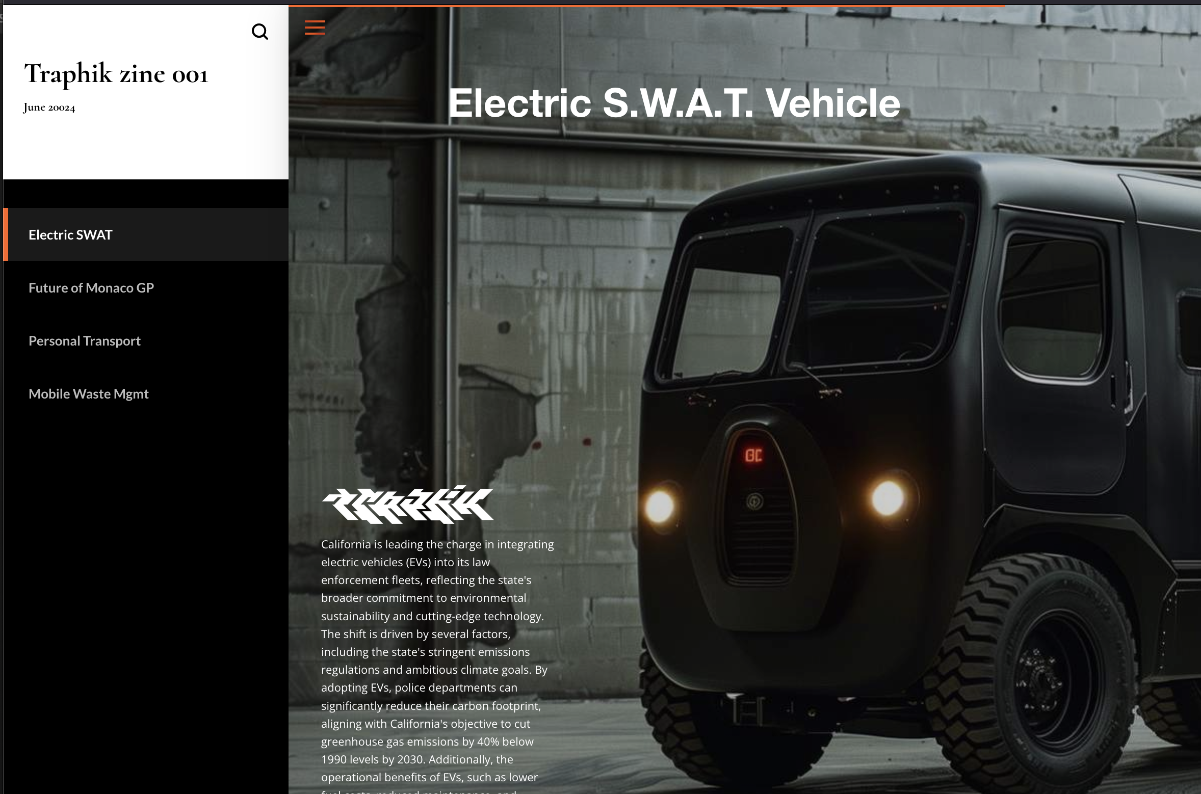
Hide progress indicators
Sometimes our lesson is not being used as a true lesson where progress needs to be tracked. This Theme Component will hide the progress circles and percentage indicator in the left navigation bar, as well as the cover page.
-
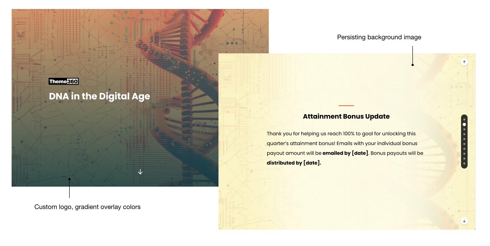
Template: Rise Microlearning wrapper
Our first Theme Wrapper gives your Microlearning course a fixed persistent background, and custom cover page styling. Make sure you use the default ‘light’ block background color for each block that should inherit your background image.
-
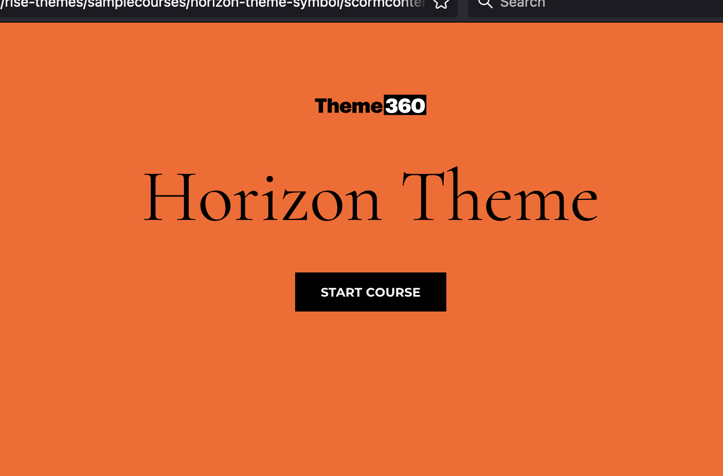
Removing or change the asterisk symbol in the Horizon theme
Horizon has this symbol above the title that perfectly matches your organization’s branding. Said no one ever. Unfortunately there is no option to change or hide it. Here is a Theme Component you can use to hide it or change it according to match your branding requirements.…
-

Branding: Microlearning Cover Page Logo
Download the sample course: To copy this code to your own course,
-
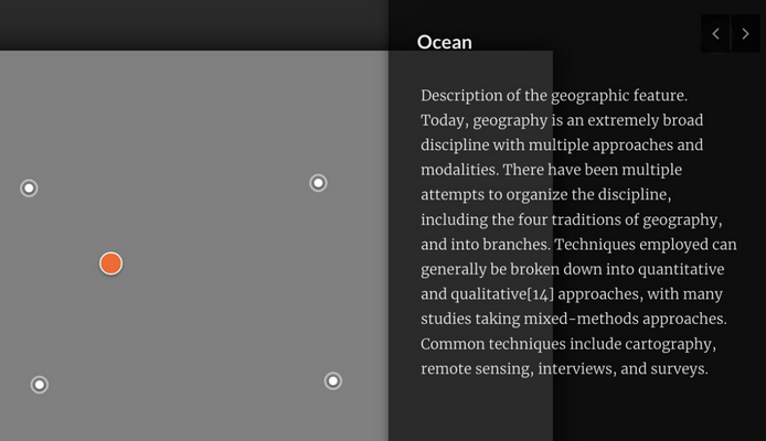
Improved Popovers for Rise 360 Labeled Graphic
The default position for the Labeled Graphic popvers can cover your image, creating a poor learning experience. This theme component moves the popover to the right of the user’s screen and provides a semi-transparent background. This UI improvement also gives more area for the explainer text.
-
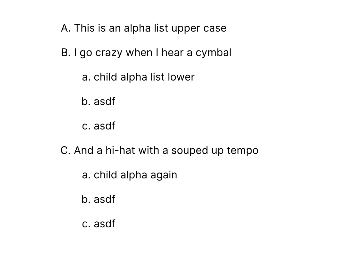
Alpha lists with children
Rise has trouble with nested list items. Use this block template to get proper ordered lists. This is an alpha list upper case I go crazy when I hear a cymbal child alpha list lower asdf asdf And a hi-hat with a souped up tempo child alpha…
-
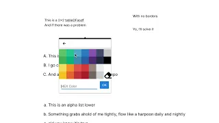
Borderless table
By default, tables in Rise always have a thin gray border. There are times when we don’t want any borders to show on the table cell data elements. Paste this into the text editor in Rise to display a table with no borders. Note: this custom table…
-
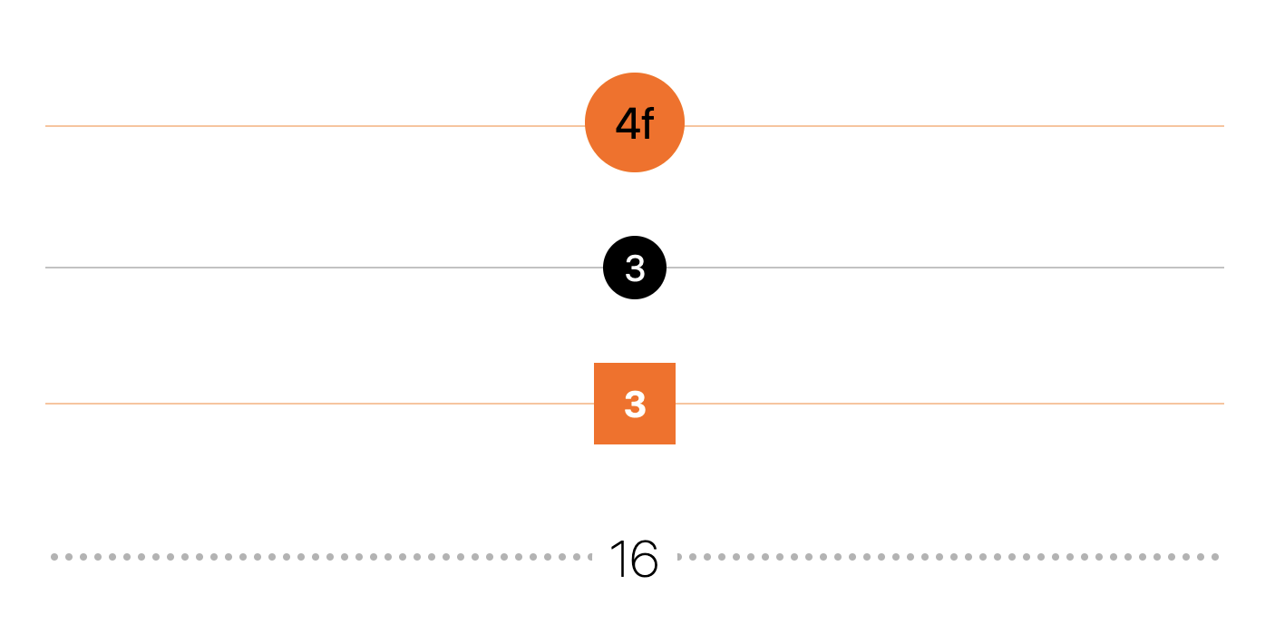
Custom Blocks: numbered dividers
One of the limitations in Rise is the numbering of divider blocks. Here’s how to create your own system for organizing and dividing your content with custom dividers. 4f 3 3 16
-
Disable text selection
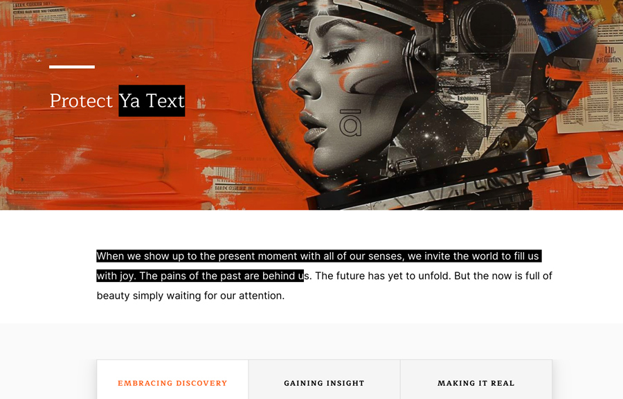
Protect your content by disabling the text to be selected. Style selected text Issue discussion on e-Learning Heroes.
-
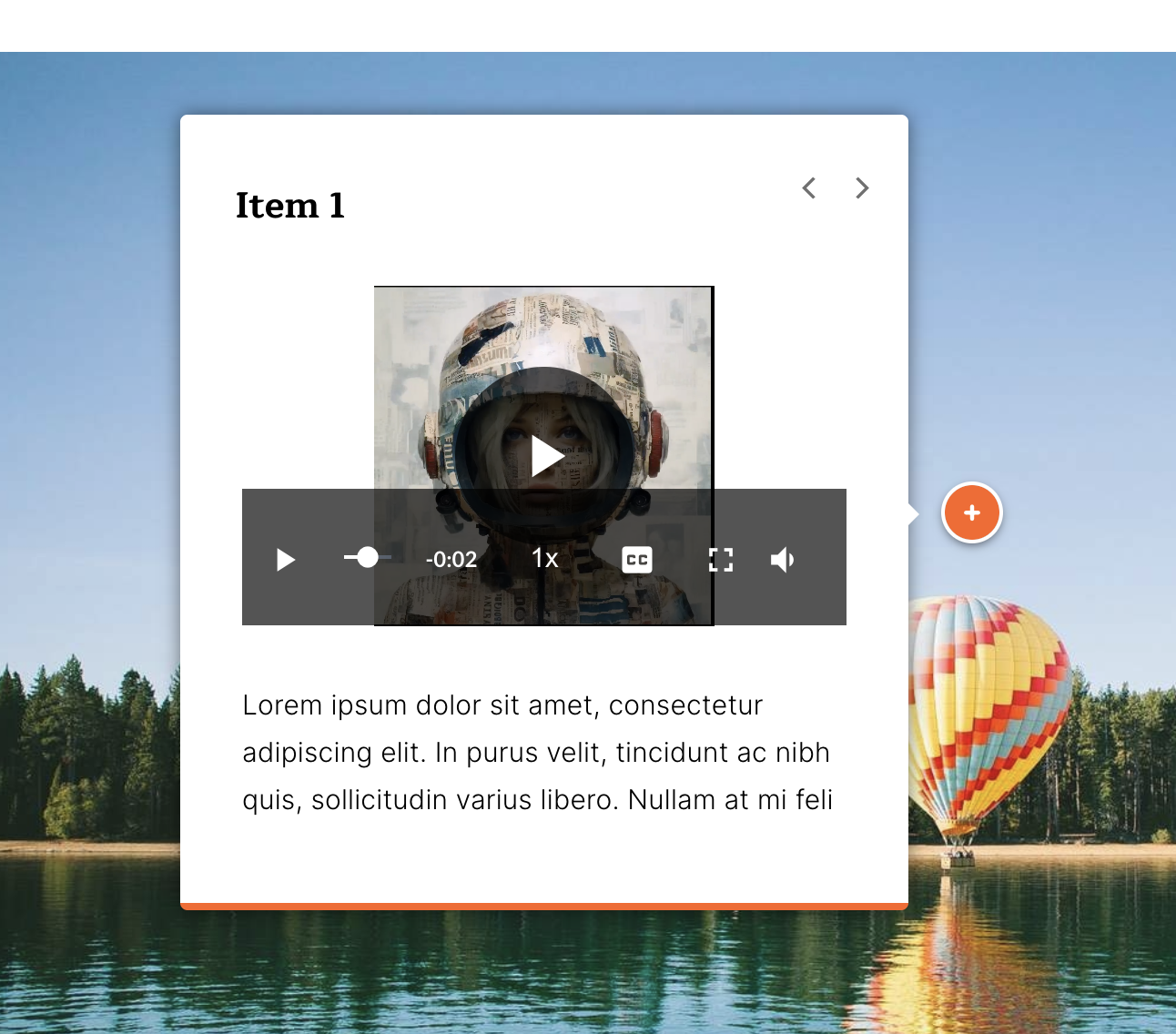
Video Player controls in labeled graphic bug fix
-
Tooltips in Rise 360
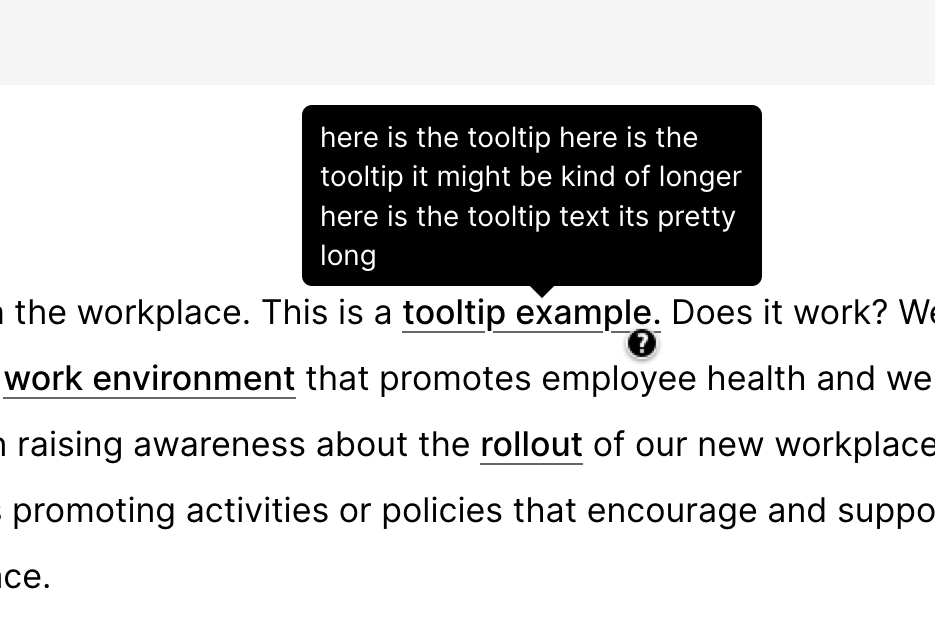
A popup or tooltip gives extra context or a definition for a term used in your course.
-
Graphical multiple choice quiz in Rise 360
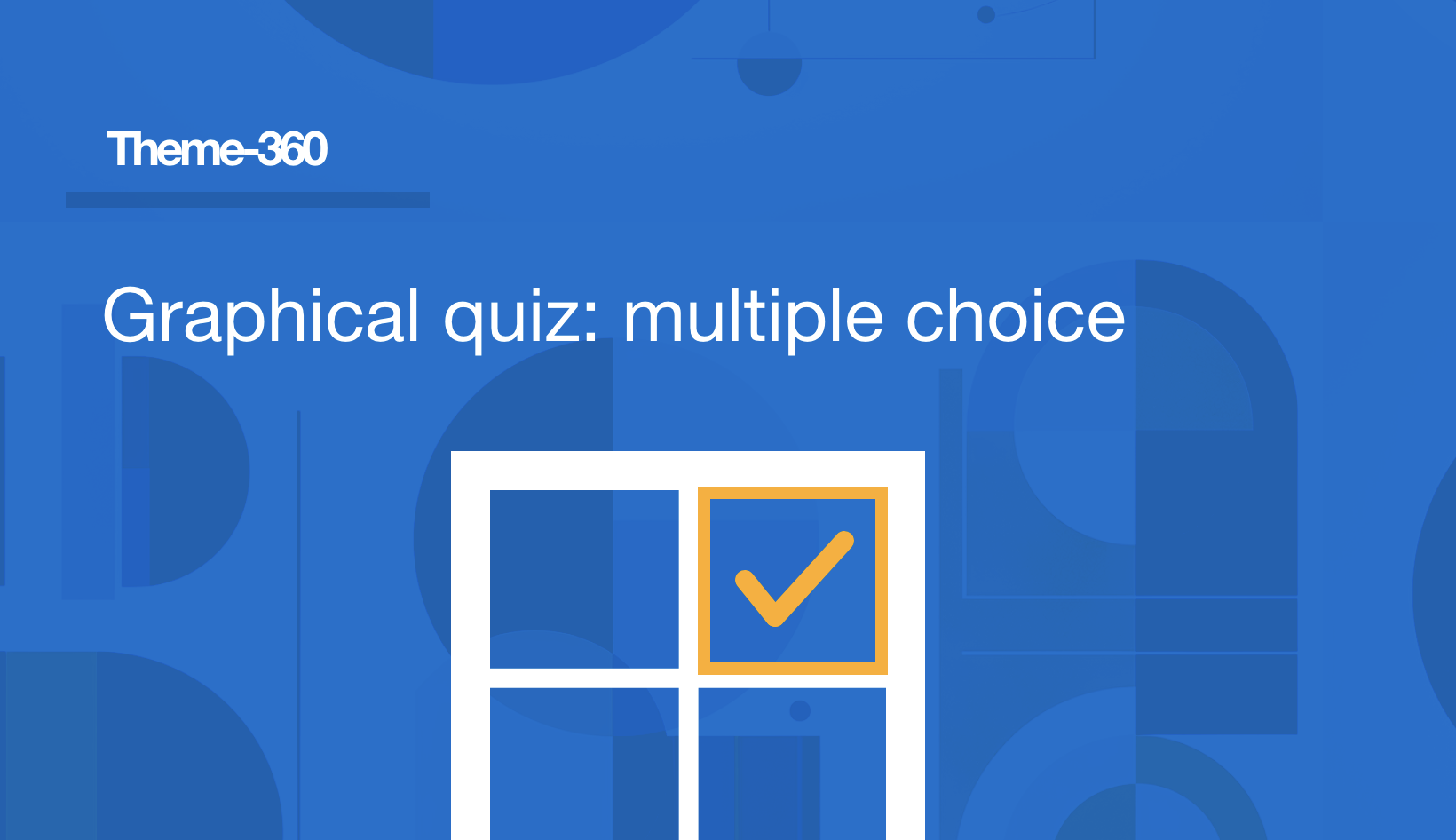
Add an interactive graphic to a multiple choice quiz in Rise 360. This theme component converts a regular multiple choice quiz into a clickable graphic.
-
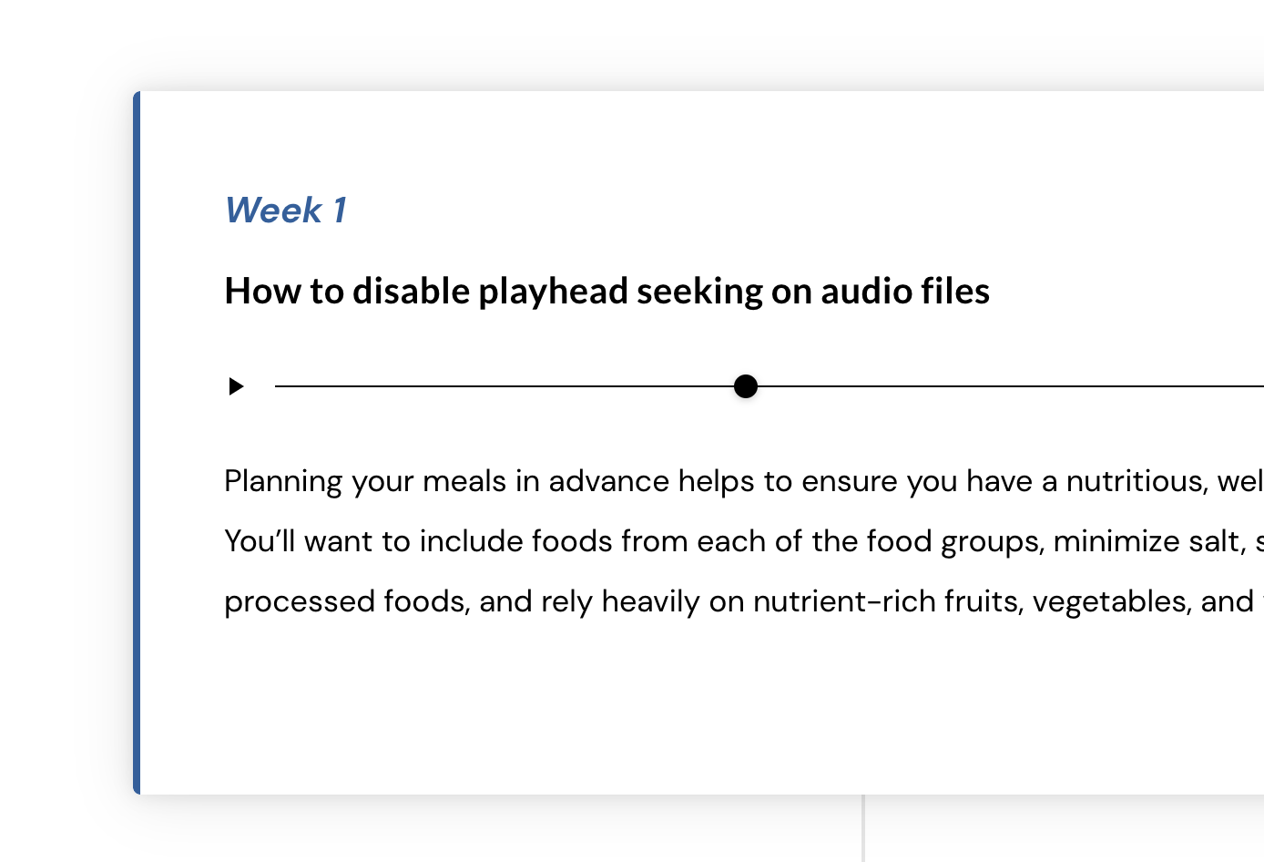
Disable audio playhead seeking
Sometimes we want to disable the playhead scrubbing so the user must listen to the entire audio file, instead of skipping ahead. There is an option for this in the video block, but not in the audio block. Use this theme component CSS to disable the playhead…
-
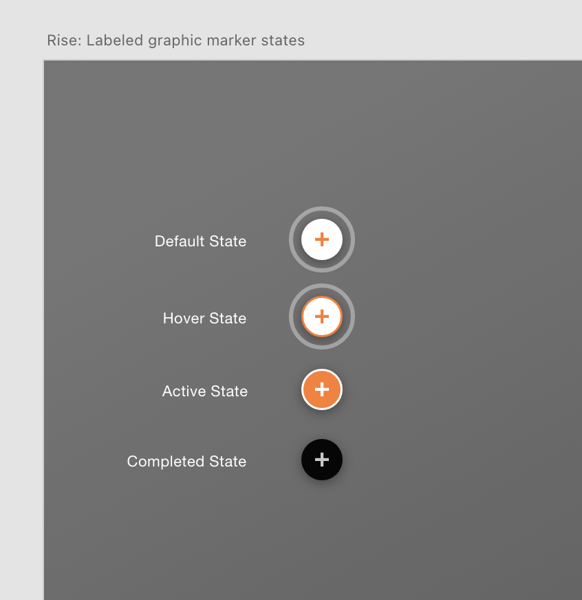
Labeled graphic states and numbering over 9
The markers in a labeled graphic have several ‘states’ including a completed state. Below are some modifications I made including stopping the marker pulse animation, a custom color outline, and a completed check mark on the completed state. Download this XD file if you want to design…
-

Video player: lower opacity of controls when paused
-
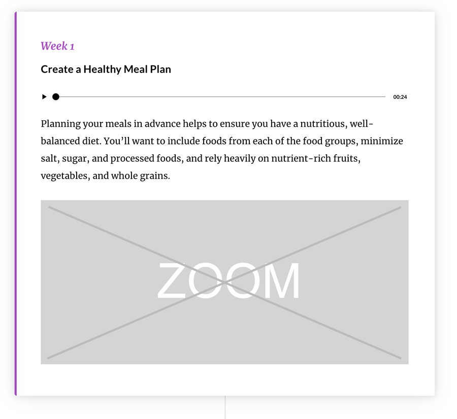
Disable image zoom in timeline block
You can disable image zoom in other blocks, but not the timeline block. Use this theme component to disable the zoom function. Another method to disable the function using inline css within Rise itself:
-

Remove pulse animation on labeled graphic
The marker animation may be unwanted due to WCAG compliance, accessibility reasons, and due to its high cpu usage from the continuous animation. issue discussion on E-Learning Heroes Download: Labeled Graphic Marker States XD file Use this file to design your own marker states. Did you know…
-
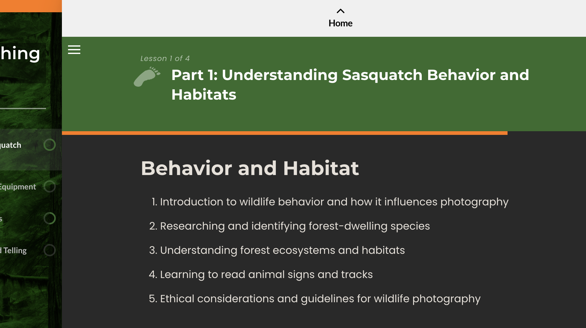
Progress Bar
The progress bar can be hard to see. This style increases the height.
-
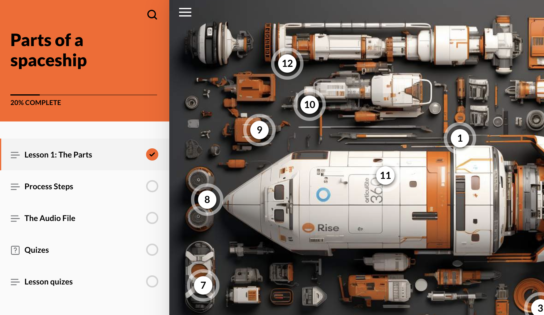
Numbered labeled graphic markers (supports unlimited amount)
The built-in limitation is numbered markers only go up to 9. Use this component for unlimited numbered markers.
-
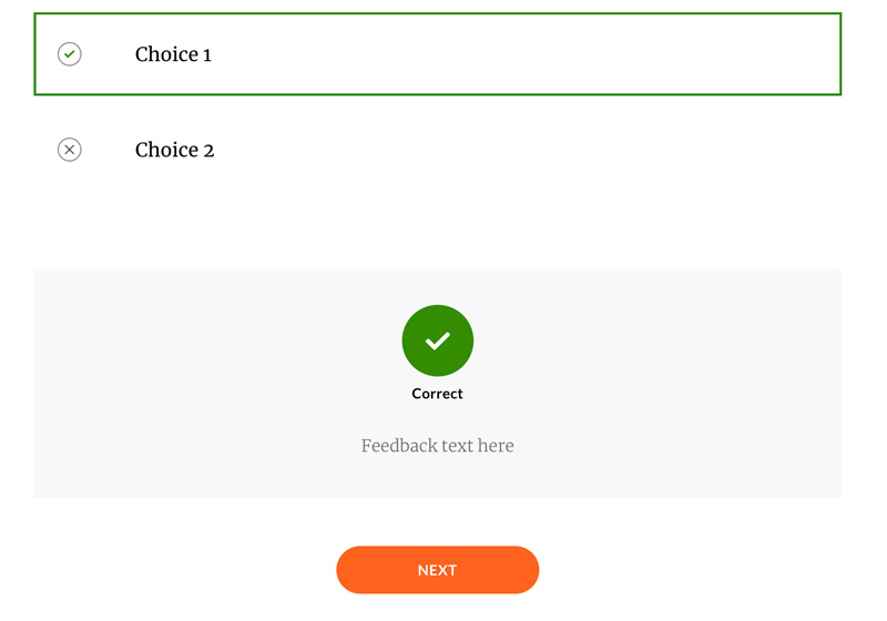
Quiz result color override
-
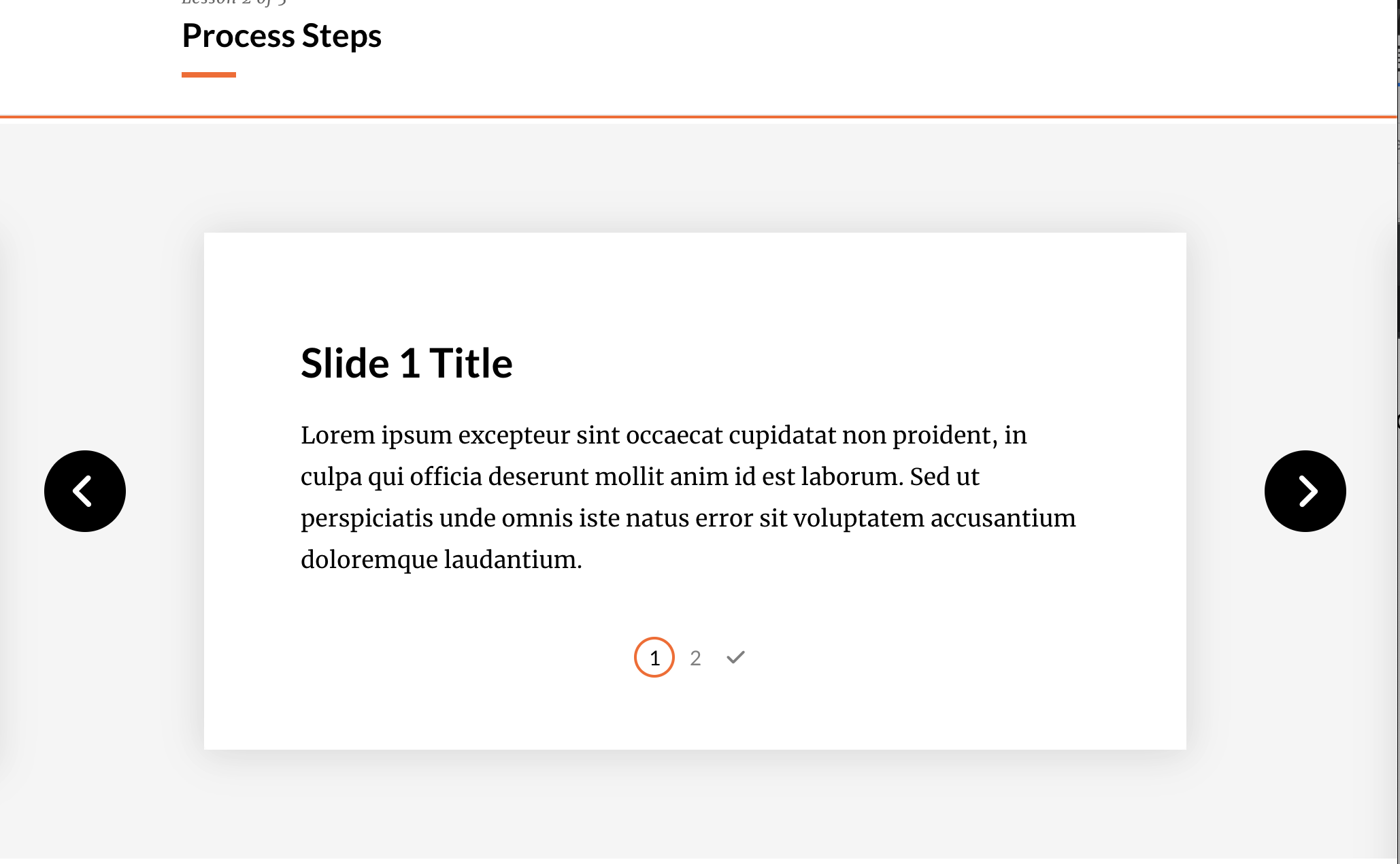
Remove or Recolor Step Labels in Process Block
Change color of step label
-
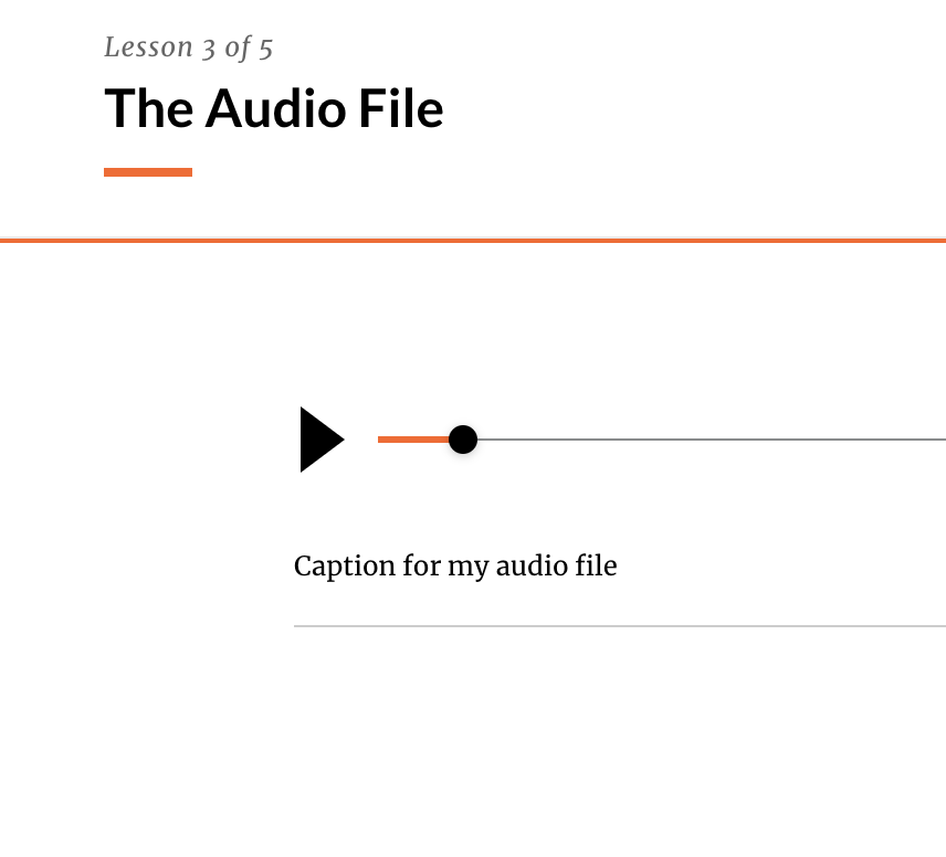
Audio Play Button Size
This css makes the default play button larger, which improves accessibility. The first rule also turns the tracker bar the same color as the ‘accent’ color for your course. Disable audio scrubber This limits the user’s ability to change the playhead position, they can only press play…
Have Branding Requirements For Your Rise Courses?

