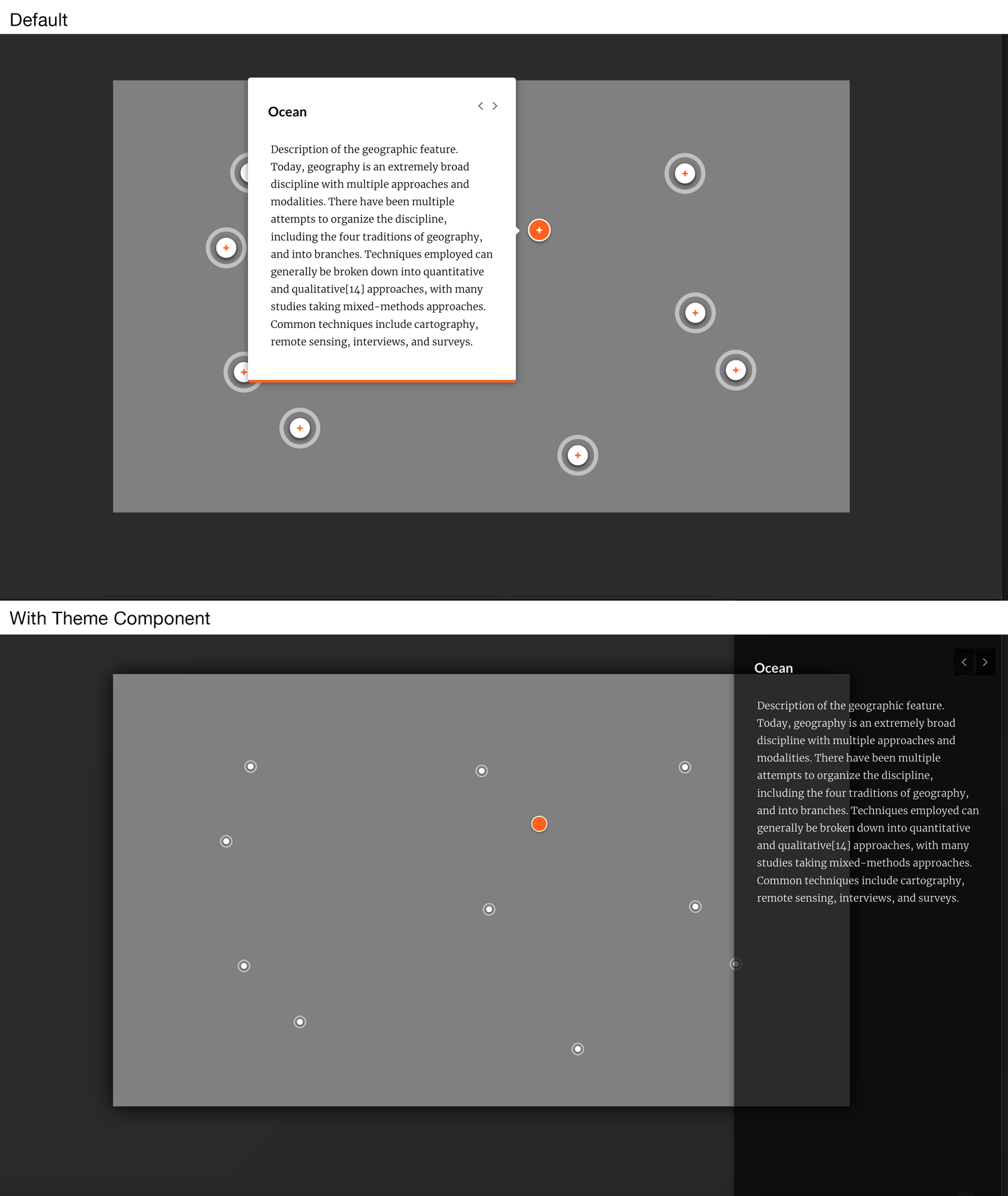
The default position for the Labeled Graphic popvers can cover your image, creating a poor learning experience. This theme component moves the popover to the right of the user’s screen and provides a semi-transparent background. This UI improvement also gives more area for the explainer text.
@media only screen and (min-width: 1200px) {

    .bubble__body::before {
        display: none;
    }

    .block-labeled-graphic {
        background: linear-gradient(135deg, #2b2b2b 0%, #282828 100%);
        min-height: 100vh
    }
    .blocks-lesson-slide__lesson.blocks-lesson-slide__lesson--slides {
        padding-top: 0;
    }

    .bubble__body {
        border-bottom: 0px;
    }
    .blocks-slide-controls {
        visibility: hidden;
    }

    .block-labeled-graphic .labeled-graphic-canvas {
        transition: 1.2s ease-in-out all;
        position: relative;
        right: 0px;
    }

    .block-labeled-graphic:has(.bubble--active) .labeled-graphic-canvas,
    .block-labeled-graphic:has(.labeled-graphic-marker--complete) .labeled-graphic-canvas {
        right: 10vw;
    }

    .bubble--active .bubble__controls {
        filter: invert(1);
    }

    .bubble__body {
        position: fixed;
        margin: 0;
        height: 100vh;
        background-color: rgba(1, 1, 1, .75);
        right: 0;
        top: 0 !important;
        bottom: auto !important;
        left: auto;
        transform: translate3d(0, 0, 0) !important;
        color: white;
        opacity: 1;
        transition: 2s ease-out background;
    }

    .bubble--active .bubble__body {
        opacity: .9;
        color: white;
        transition: .4s ease-out opacity;
    }

    .bubble--active .bubble__body:hover {
        opacity: 1
    }

    .lesson-one-page-slides__controls > button {
        opacity: .1;
    }

    .bubble--active .bubble__controls button {
        margin-left: 2px;
        background: white;
    }

    .bubble--active .bubble__controls button i {
        padding: 4px 9px;
    }

}