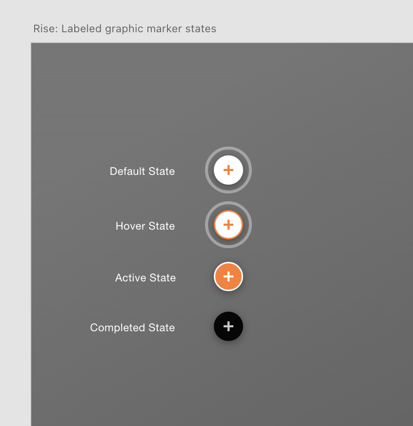
The markers in a labeled graphic have several ‘states’ including a completed state.
Below are some modifications I made including stopping the marker pulse animation, a custom color outline, and a completed check mark on the completed state. Download this XD file if you want to design your own custom markers and test with your images.

/* remove marker pulse animation */

button .labeled-graphic-marker__pin::after {
    animation:none;
    display:none
}


/* this automatically adds numbers to replace the default + icon in a labeled graphic. Select a different icon if you don't want numbers on another labeled graphic in your course */

.labeled-graphic-canvas ol {counter-reset: css-counter 0;}
ol li.map-item {counter-increment: css-counter 1;}

ol li.map-item i.icon.icon-Master-01::before {
  content: counter(css-counter);
  color:black; font-weight:600; font-size:16px;
  font-family: var(--font-family-ui);
  line-height: 1.8;
  display: block;
}


/* optional- extra accent color around marker, set to a background-color */
.labeled-graphic-marker.labeled-graphic-marker--visible {
 background-color:#8af659;
}

/* completed state: remove accent color above */
.labeled-graphic-marker--complete.labeled-graphic-marker--visible {
background-color:rgba(1,1,1,.4);
}

/* completed state: change number to checkmark */
button.labeled-graphic-marker--complete:not(.labeled-graphic-marker--active).labeled-graphic-marker--visible i.icon.icon-Master-01::before {
content:"✓"
}


/* for smaller screens, scale down markers, remove extra hilight color */
@media only screen and (max-width : 768px) {
.labeled-graphic-marker.labeled-graphic-marker--visible {
  background: transparent;
}
ol li.map-item i.icon.icon-Master-01::before {
font-weight:400; font-size:12px;
     line-height: 1.6;
    }

}